A picture is worth a thousand words!
In this insightful video Jaclyn Tanenbaum, associate teaching professor of marketing and logistics, shares essential tips to effectively convey marketing research findings to decision-makers.
Discover the key strategies for engaging stakeholders, aligning with executive expectations, and delivering research results that not only meet but exceed expectations. Tanenbaum will guide you through creating presentations that are not only visually appealing but also easy to understand and packed with actionable insights.
Whether you're starting a new research project or looking to improve your presentation skills, these expert tips will ensure your work stands out and delivers impact from start to finish.
Watch the full interview with Jaclyn Tanenbaum on our YouTube Channel.
Full Transcript
Jaclyn Tanenbaum: First, we want to make sure that we're partnering with all of the key stakeholders and the C-Suite executives before the project even begins.
We want to make sure that everyone's on the same page when it comes to the research goals, the research objectives, understanding the types of questions that we want to ask, making sure that we're all aligned and we're on the same page before the project starts.
Then once the project is over, we are able to deliver high quality research that met the objective that everybody agreed upon from the very beginning. So, we are making sure to set the expectations first, and then meet, and then hopefully exceed those expectations once the project is finished.
When we're doing this then, and we're thinking about the results presentation, we want to make sure that we're sharing valuable and actionable insights, not just data points. We also want to make sure again, that the information is easy to understand, that it's compelling, and it's presented in a way visually that illustrates the main points that we're trying to get across without getting too bogged down in things like jargon and unnecessary information.
You're looking for something that's going to be visually appealing, easy to understand, simple, and to the point, so that you can leave the meeting and go take action based on all the information that you just learned.
When I'm thinking about building presentations, there's a typical flow that I think is very useful. So I'll typically start with the project overview. “Why are we here, what was the research question, what was the research objectives?” Kind of resetting the stage.
Then I'm going to talk about the methods that we use to collect data. “What were the questions that we asked, how did we obtain our sample?”
I'll tell a little bit about the research respondents themselves, who they are, so that we can understand that they were the right targets for this project. Then, I'll give the summary of results and then I don't stop there.
We want to make sure that we have some good actionable recommendations and implications based on the data that we obtained from the research project.
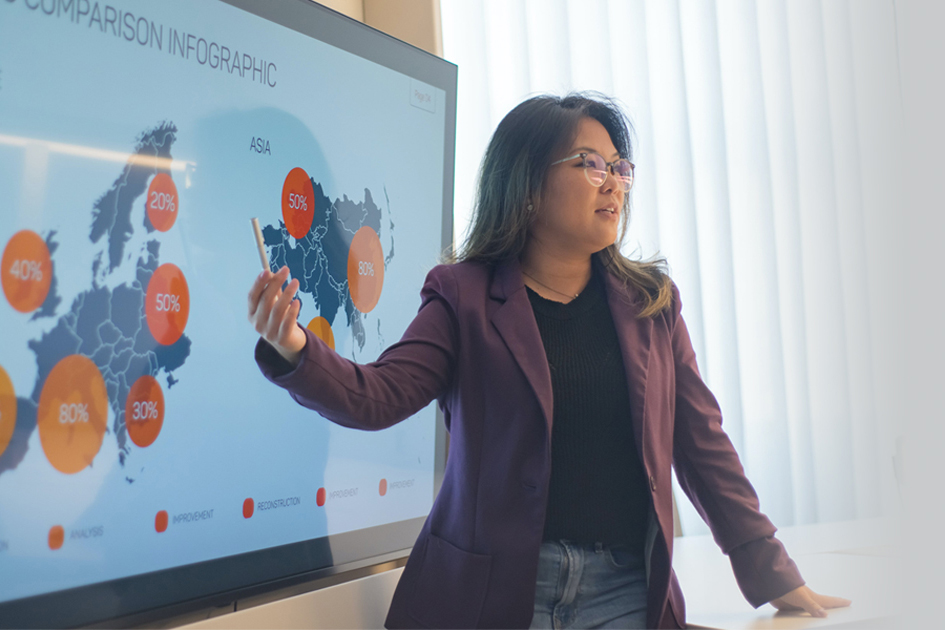
One of the tools that's really useful today when we're talking about data visualization and putting together high-quality results presentations, is infographics. Infographics are like a visual representation of data, and they can be very, very meaningful and useful in helping people understand the point that we're trying to get across. Because basically we're showing data in the form of pictures, not just in the form of charts, graphs or words.
You know the saying, “A picture is worth 1,000 words,” right? Same idea here when it comes to infographics. So, they can be really great resources when we're trying to communicate main points and main ideas back to our intended audiences.


